The page navigation is complete. You may now navigate the page content as you wish.
Skip to main content

App Header

Added in v4.8.0

A header navigation that provides access to global elements and application utilities.

The App Header provides consistent controls for navigating between global areas of the application (organizations and projects) and accessing application utilities like support, documentation, and user settings. It should be paired with the Side Nav component within the App Frame (in code).

Usage

When to use

  • Provide consistent global navigation across an application.
  • Offer quick access to important utilities such as user settings, help, and search.
  • Establish a clear visual hierarchy and brand presence at the top of the application.

When not to use

  • To navigate within subpages of an organization or project, use the Side Nav instead.

The App Header provides consistent navigation between global application areas, such as organizations and projects, while facilitating easy access to utilities like support and user settings.

In the hierarchy of navigational elements, the App Header sits at the top and is followed by:

  • The Side Nav, which focuses on contextual pages and subpages within a project or organization.
  • The App Footer, which focuses on non-essential metadata and general links.
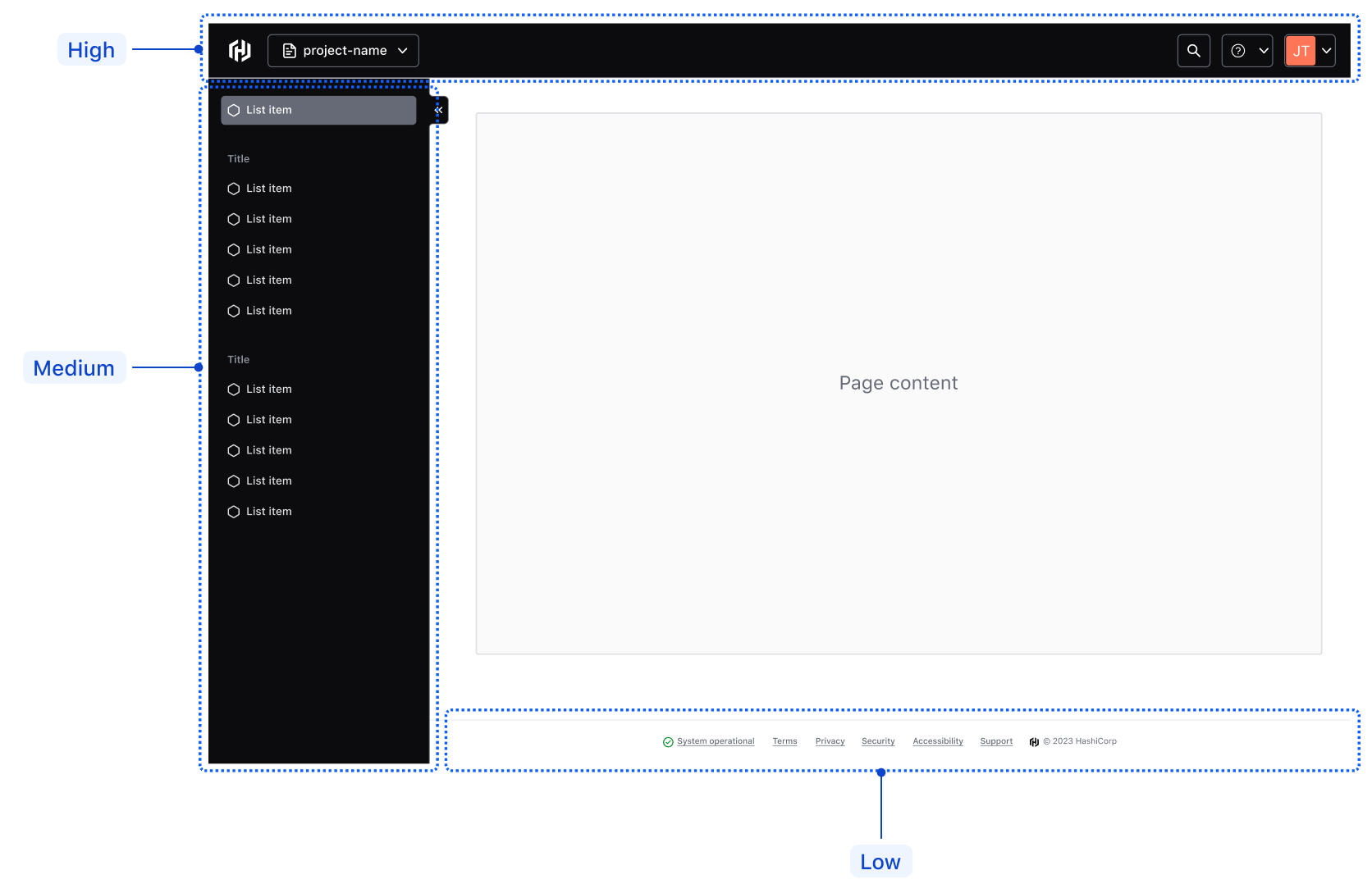
Example of the hierarchy of navigation elements

The home link gives users quick, consistent access to the application's home page or dashboard.

For cloud products, the icon should always be hcp. For standalone or open-source products, it should be the product’s service icon; e.g., terraform.

Examples of the Home link using different logos

Context switcher

The context switcher allows users to switch between different global contexts within the product or application, such as navigating between different organizations or projects.

Context switcher within the App Header

This element only exists in Figma. For implementation in code, use the HDS Dropdown or, if necessary, create your own custom component styled after the Dropdown.

Utility navigation

Help dropdown

Use the help dropdown to provide users with access to support and helpful resources that can be easily accessible from anywhere within the application, e.g., links to the help center, documentation, or tutorials.

Avoid placing non-help-related links within the help dropdown menu.
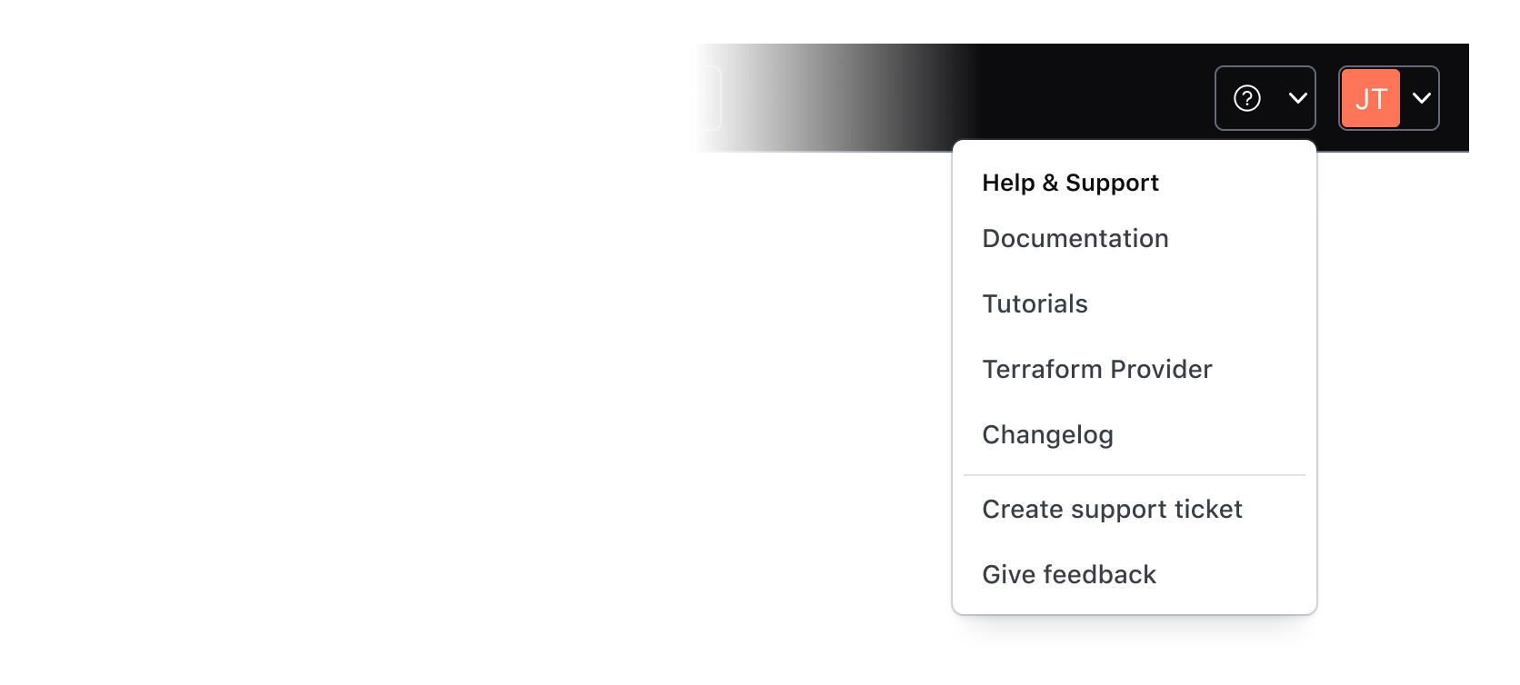
Help dropdown in the App Header

User dropdown

The user dropdown gives users quick and easy access to their settings and preferences. The menu should contain links or actions related to the user's profile, settings, and/or preferences.

Avoid placing links to unrelated pages within the user dropdown menu.

User dropdown in the App Header

Search within the App Header is triggered by a standard HDS Button themed to match the App Header’s styles. The application teams are responsible for building search capabilities themselves, if and when needed.

Search in the App Header

Sizes

The Hds::AppHeader component supports basic responsive behavior out of the box with a single breakpoint at 1088px. The Figma component offers two variants:

  • Large: applicable for most desktop-sized viewports with a minimum width of 1088px.
  • Small: applicable for most mobile and some tablet-sized viewports with a maximum width of 1088px.

Large size of the App Header

Small size of the App Header

In the Ember component, the controls (context switcher, help/user dropdown, etc) contained within the App Header will collapse automatically into a vertical menu that can be toggled open and closed with the Menu button.

In Figma, we publish a separate Menu component for UIs and prototypes for smaller viewports.

Example of the App Header menu at smaller viewports

Responsive characteristics

By default (and if used within the App Frame), the App Header will occupy 100% of the viewport width. As the viewport width condenses, the components' controls will collapse into a menu that can be toggled open/closed with the menu button (shown conditionally based on the viewport width).

At smaller viewports, the menu containing the AppHeader controls will occupy 100% of the viewport height and prevent scrolling content on the main page.

Usage in the App Frame

The AppHeader is intended to be used within the AppFrame component (only supported in code), where a location is reserved for the component out of the box.

If you intend to use the AppHeader without the AppFrame, contact the HDS team for assistance and guidance on implementation.

Release plan

The AppHeader is being rolled out in a phased approach. In the phase one release, we will assist consumers in adoption spikes to optimize it to their needs. This unique approach is due to how the AppHeader tightly integrates into the release plan for the “Enterprise navigation” which includes the SideNav and AppFrame components.

At this time, we do not recommend adoption on your own. Please contact the Design Systems Team for assistance.

How to use this component

The AppHeader provides persistent global navigation controls and utility links such as help and user menus. It is meant to be paired with the SideNav which should be used to provide local or page-level navigation. Both these components are intended to be used within the Hds::AppFrame component. The AppHeader specifically should be used within the App Frame’sFrame.Header` contextual component.

Layout

The AppHeader exposes three “slots” (named blocks) where consumers can yield the navigation content and also add business logic to control the content.

The <:logo> block should contain the AppHeader::HomeLink which is provided as a child component.

The other two slots are intended for consumer-provided controls. The <:globalActions> block should typically contain a “context switcher” (sometimes called an “org switcher” or “project switcher”). The <:utilityActions> block is used to provide utilities including “Help” and “User” menus and, optionally, “Search”.

The page navigation is complete. You may now navigate the page content as you wish.
Skip to main content

App Header

Added in v4.8.0

A header navigation that provides access to global elements and application utilities.

The App Header provides consistent controls for navigating between global areas of the application (organizations and projects) and accessing application utilities like support, documentation, and user settings. It should be paired with the Side Nav component within the App Frame (in code).

Usage

When to use

  • Provide consistent global navigation across an application.
  • Offer quick access to important utilities such as user settings, help, and search.
  • Establish a clear visual hierarchy and brand presence at the top of the application.

When not to use

  • To navigate within subpages of an organization or project, use the Side Nav instead.

The App Header provides consistent navigation between global application areas, such as organizations and projects, while facilitating easy access to utilities like support and user settings.

In the hierarchy of navigational elements, the App Header sits at the top and is followed by:

  • The Side Nav, which focuses on contextual pages and subpages within a project or organization.
  • The App Footer, which focuses on non-essential metadata and general links.

Example of the hierarchy of navigation elements

The home link gives users quick, consistent access to the application's home page or dashboard.

For cloud products, the icon should always be hcp. For standalone or open-source products, it should be the product’s service icon; e.g., terraform.

Examples of the Home link using different logos

Context switcher

The context switcher allows users to switch between different global contexts within the product or application, such as navigating between different organizations or projects.

Context switcher within the App Header

This element only exists in Figma. For implementation in code, use the HDS Dropdown or, if necessary, create your own custom component styled after the Dropdown.

Utility navigation

Help dropdown

Use the help dropdown to provide users with access to support and helpful resources that can be easily accessible from anywhere within the application, e.g., links to the help center, documentation, or tutorials.

Avoid placing non-help-related links within the help dropdown menu.

Help dropdown in the App Header

User dropdown

The user dropdown gives users quick and easy access to their settings and preferences. The menu should contain links or actions related to the user's profile, settings, and/or preferences.

Avoid placing links to unrelated pages within the user dropdown menu.

User dropdown in the App Header

Search within the App Header is triggered by a standard HDS Button themed to match the App Header’s styles. The application teams are responsible for building search capabilities themselves, if and when needed.

Search in the App Header

Sizes

The Hds::AppHeader component supports basic responsive behavior out of the box with a single breakpoint at 1088px. The Figma component offers two variants:

  • Large: applicable for most desktop-sized viewports with a minimum width of 1088px.
  • Small: applicable for most mobile and some tablet-sized viewports with a maximum width of 1088px.

Large size of the App Header

Small size of the App Header

In the Ember component, the controls (context switcher, help/user dropdown, etc) contained within the App Header will collapse automatically into a vertical menu that can be toggled open and closed with the Menu button.

In Figma, we publish a separate Menu component for UIs and prototypes for smaller viewports.
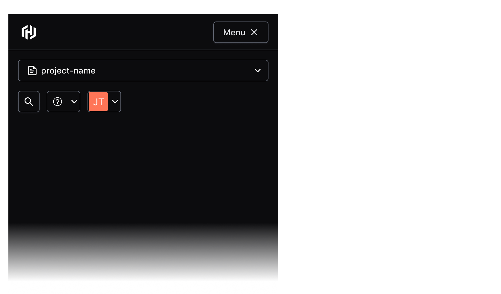
Example of the App Header menu at smaller viewports

Responsive characteristics

By default (and if used within the App Frame), the App Header will occupy 100% of the viewport width. As the viewport width condenses, the components' controls will collapse into a menu that can be toggled open/closed with the menu button (shown conditionally based on the viewport width).

At smaller viewports, the menu containing the AppHeader controls will occupy 100% of the viewport height and prevent scrolling content on the main page.

Usage in the App Frame

The AppHeader is intended to be used within the AppFrame component (only supported in code), where a location is reserved for the component out of the box.

If you intend to use the AppHeader without the AppFrame, contact the HDS team for assistance and guidance on implementation.

Release plan

The AppHeader is being rolled out in a phased approach. In the phase one release, we will assist consumers in adoption spikes to optimize it to their needs. This unique approach is due to how the AppHeader tightly integrates into the release plan for the “Enterprise navigation” which includes the SideNav and AppFrame components.

At this time, we do not recommend adoption on your own. Please contact the Design Systems Team for assistance.

How to use this component

The AppHeader provides persistent global navigation controls and utility links such as help and user menus. It is meant to be paired with the SideNav which should be used to provide local or page-level navigation. Both these components are intended to be used within the Hds::AppFrame component. The AppHeader specifically should be used within the App Frame’sFrame.Header` contextual component.

Layout

The AppHeader exposes three “slots” (named blocks) where consumers can yield the navigation content and also add business logic to control the content.

The <:logo> block should contain the AppHeader::HomeLink which is provided as a child component.

The other two slots are intended for consumer-provided controls. The <:globalActions> block should typically contain a “context switcher” (sometimes called an “org switcher” or “project switcher”). The <:utilityActions> block is used to provide utilities including “Help” and “User” menus and, optionally, “Search”.